Digital Marketing
29 May 2025
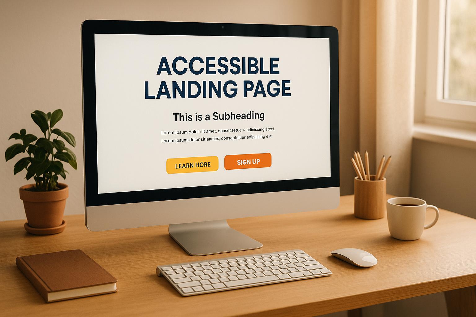
5 Visual Design Tips for Accessible Landing Pages

Deven Bhatti
Learn essential visual design tips for creating accessible landing pages that enhance user experience and boost conversions.
Want your landing pages to work for everyone while boosting conversions? Start by focusing on accessibility. Here’s how:
Ensure proper color contrast: Use a minimum contrast ratio of 4.5:1 for text to make content readable for users with visual impairments.
Choose readable fonts: Stick to clean, sans-serif fonts like Arial or Verdana, with a minimum size of 16px and proper spacing.
Organize with clear layouts: Use semantic HTML, white space, and logical heading structures for easier navigation.
Add focus indicators: Make interactive elements keyboard-friendly with visible outlines or highlights.
Provide alt text and captions: Describe images with alt text and add captions or transcripts for videos to accommodate all users.
These steps don’t just meet accessibility standards - they improve user experience for everyone, including people with disabilities, older adults, and mobile users. Accessible design can also reduce bounce rates and increase conversions, as seen in businesses achieving up to a 15% boost in sales.
Accessibility benefits everyone. Ready to make your landing pages inclusive and effective? Let’s dive in!
Landing page tutorial - Accessibility (Part 10 of 12)
1. Use Proper Color Contrast for Better Readability
Getting color contrast right is a game-changer for readability. It ensures your content is clear and accessible to everyone - whether they're dealing with visual impairments, navigating aging eyesight, or just trying to read your page in bright sunlight or on a dim screen.
Here’s a startling fact: 79.1% of homepages analyzed in WebAIM's 2025 accessibility report had issues with contrast [1]. Considering over 2.2 billion people live with visual impairments [1], and 8% of males and 1% of females experience color vision deficiencies [7], poor contrast could mean alienating a large chunk of your audience.
WCAG Color Contrast Standards: What You Need to Know
The Web Content Accessibility Guidelines (WCAG) 2.1 provide clear benchmarks for color contrast. Ratios range from 1:1 (no contrast) to 21:1 (maximum contrast, like black on white) [1]. Here’s what you should aim for:
WCAG Level | Text Size | Contrast Ratio |
|---|---|---|
AA | Normal Text | 4.5:1 |
AA | Large Text (18pt or 14pt bold) | 3:1 |
AAA | Normal Text | 7:1 |
AAA | Large Text | 4.5:1 |
AA compliance is a good starting point, especially for users with mild vision loss (common for those aged 45 and older) [1]. For those with more severe impairments or aging eyes (70+ years), AAA compliance is even better [1]. Non-text elements like buttons, form fields, and icons also need a 3:1 contrast ratio against their backgrounds [2].
"Adequate contrast is necessary for all users, especially users with low vision." - Wave Accessibility Evaluation (WAVE) tool [3]
By meeting these standards, you’re not just checking a box - you’re creating a more inclusive experience.
Tools to Help You Get It Right
You don’t have to guess when it comes to testing your color contrast. Free tools make it easy to check and adjust your designs:
WebAIM Contrast Checker: Enter your foreground and background colors (hex codes or RGB values) to instantly see your contrast ratio. It also shows whether your design meets AA or AAA standards [1]. Bonus: Use its API feature (
&api) to get JSON-formatted results [4].TPGi Colour Contrast Analyser (CCA): This tool goes beyond basics with features like color blindness simulation and adjustable sliders for tweaking colors. It even supports alpha transparency, making it perfect for designs with overlays or semi-transparent elements [5].
Figma’s Color Contrast Checker: If you’re designing in Figma, this built-in feature lets you test compliance directly in the tool. It also offers simulations to see how your design looks to users with different types of color blindness [6].
With these tools, you can fine-tune your color choices until they meet the 4.5:1 ratio for normal text.
Avoiding Common Color Pairing Pitfalls
Even if your colors technically meet contrast ratios, some combinations can still cause problems. For example, light gray text on a white background might look sleek but often becomes unreadable for people with visual impairments.
Here’s a real-life example: A university website used light blue links (#5B8DAD) on a light gray background (#EEEDE8), resulting in a contrast ratio of just 3.05:1 - far below the WCAG standard of 4.5:1 for normal text. This led to 159 contrast errors across the site, frustrated users, and increased support calls [7].
What to avoid:
Light gray text on white or very light backgrounds
Dark text on dark backgrounds
Similar hues that blend together (e.g., medium blue on slightly darker blue)
Relying solely on color to convey important information
Instead, combine color with other visual cues like bold text, icons, or distinct shapes. This approach makes your design more accessible to everyone, including the 8% of men and 1% of women with color vision deficiencies [7]. It’s a small change that can make a big difference for your audience.
2. Pick Fonts and Typography That Work for Everyone
Typography plays a crucial role in ensuring your content is accessible to all visitors. Poor font choices can create challenges for users with visual impairments, dyslexia, or cognitive disabilities. Thoughtful typography decisions enhance readability for everyone, not just those with specific accessibility needs.
"When we style for the extremes and we do it well, everyone benefits." - David Berman [10]
Use Clean, Readable Fonts
For digital content, especially on landing pages, sans-serif fonts are a smart choice. Fonts like Arial, Verdana, Calibri, or Tahoma are designed with readability in mind. Their clean lines and distinct character shapes make them easier to read [8].
Look for typefaces with tall x-heights and open apertures, which help distinguish similar-looking characters. These features are especially helpful for users who might struggle to differentiate between letters like "o" and "e" or "l" and "1" [9].
Research shows that even people without disabilities, aged 13 to 45, can struggle with certain letters and symbols. The challenge becomes even greater for individuals with low vision, dyslexia, or those over 45 [9]. This underscores the importance of choosing fonts that minimize confusion.
Avoid decorative or script fonts that blur the distinctions between letters. Fonts where "l" (lowercase L), "I" (uppercase i), and "1" (the number one) look nearly identical should also be avoided. If you prefer serif fonts, limit their use to headings or highlights, as sans-serif fonts are generally easier to read on screens [8].
Set Proper Font Sizing and Spacing
A comfortable reading experience starts with proper font size and spacing. Use a minimum font size of 16px and a line height of at least 1.5 times the font size [11][12]. For instance, with 16px text, aim for a line height of 24px to maintain readability.
Ensure letter and word spacing can adjust to at least 0.12 and 0.16 times the font size, respectively [11][12]. These adjustments can make a significant difference for readers with visual impairments.
Avoid using all-caps for body text. While it might grab attention, all-caps text is harder to read because it removes the distinct shapes of lowercase letters. Instead, opt for bold formatting or a slightly larger font size to emphasize key points [9].
For flexibility, implement responsive font sizing using rem or em units rather than fixed pixels. This allows users to adjust text size in their browser settings, an essential feature for those with visual impairments [13]. Responsive sizing also ensures your content adapts well to mobile devices, where clarity is even more critical.
Make Typography Work on Mobile
Mobile typography deserves extra care due to smaller screens and tighter reading spaces. Stick to a 16px minimum font size for body text, increasing sizes as needed for clarity.
For mobile, adjust line spacing (leading) to about 1.6 times the font size for body text, 1.4 times for subheadings, and 1.2 times for main headings [14]. Additionally, limit line length to a maximum of 80 characters in landscape mode [14] to help readers keep track of their place.
Consider offering a manual font size adjustment option. This feature empowers users to customize their reading experience, reducing eyestrain - especially when engaging with long content or detailed product descriptions. Clear, adaptable typography ensures your content remains accessible and user-friendly across all devices.
3. Build Clear Layout with Visual Hierarchy
` help structure your page, making it easier for screen readers to navigate. For example, a user with a screen reader can jump straight to the main content or navigation menu without having to sift through every element on the page [15].
Start with the basics of semantic HTML to organize your layout effectively. Use <header> for key introductory elements like your logo and main navigation. Wrap navigation links in a <nav> element, and include a single <main> element per page, ensuring it’s not nested within other tags [15]. For specific content, such as testimonials or case studies, use <article>. Group related sections with <section>, and when listing features or benefits, rely on <ul> or <ol> tags instead of styled <div> elements [16].
"Please use semantic HTML. It's not a ranking factor, but it can help our systems to understand your content better." - John Mueller, Google Search Advocate [16]
Organize your headings clearly by using <h1> through <h6> tags to outline the structure of your content [16]. Your primary headline should use <h1>, major sections should have <h2>, and subsections can be defined with <h3>. This hierarchy ensures your layout is easy to follow and aligns with accessibility standards.
Once your structure is in place, you can enhance usability further by incorporating white space strategically.
Use White Space and Group Content Well
White space isn’t just empty space - it’s a powerful design tool that improves readability and helps users focus. By guiding visitors naturally through your content, white space reduces cognitive load, which is particularly helpful for users with attention or processing challenges.
Distinguish between micro and macro white space. Micro white space refers to small gaps, such as those between letters, words, or form fields. Macro white space, on the other hand, separates larger elements like images, columns, or entire sections [17][18]. Together, they create a clean, organized layout that enhances the user experience.
For example, white space can highlight key elements like call-to-action (CTA) buttons. Amazon uses ample white space around its "Get started" button to make it stand out [17]. Similarly, Lull places generous spacing around CTAs, helping users focus on decisions without unnecessary distractions [18].
Group related content with consistent spacing. When elements are placed closer together, users associate them as related. Flywheel, for instance, uses size and spacing effectively to group pricing details [18]. For forms, follow Salesforce’s example by adding white space around each field. This approach makes forms less overwhelming, especially on mobile devices, and helps users focus on one input at a time [18].
"White space is to be regarded as an active element, not a passive background." - Jan Tschichold [19]
After refining your layout and spacing, the next step is to ensure your design supports keyboard navigation.
Support Keyboard Navigation
For users who rely solely on keyboards, accessibility is crucial. All interactive elements should be accessible through native HTML and proper tabindex attributes [20]. When creating custom interactive components, use tabindex="0" to make them focusable, but avoid higher values as they can disrupt the natural navigation flow [20].
Design navigation to follow a logical sequence, typically mirroring the visual flow of your page - left to right and top to bottom [20]. Ensure your HTML source code reflects this order, and use CSS only for visual styling without altering the logical navigation sequence [20].
Include navigation shortcuts to improve usability. For example, add a "skip to main content" link at the top of your page, allowing keyboard users to bypass lengthy navigation menus [20]. Use ARIA landmarks like <main> and <nav> to make section navigation seamless [20].
Interaction | Keystrokes | Notes |
|---|---|---|
Navigate to interactive elements | Tab (forward), Shift + Tab (backward) | Ensure focus indicators are visible and navigation order is logical. |
Activate links | Enter | |
Activate buttons | Enter or Spacebar | Elements with ARIA |
Test your keyboard navigation by unplugging your mouse. Use only the Tab, Shift+Tab, Enter, and Spacebar keys to navigate your landing page [20]. Confirm that focus indicators are clear and every interactive element is accessible in a logical order. This hands-on approach ensures a user-friendly experience for all.
4. Design and Test Clear Focus Indicators
Once you've established a clear visual hierarchy, the next step is ensuring that interactive elements on your landing page are easy to identify with effective focus indicators.
Focus indicators are visual signals that highlight the currently active element on your page, making them crucial for users navigating with a keyboard. For the 1 in 4 adults in the U.S. who have a disability and depend on keyboard navigation for browsing, these indicators are not just helpful - they’re essential [23].
These indicators act as a guide, showing users where they are on the page and helping them interact with buttons, links, and form fields. Without them, keyboard users face significant challenges, leading to frustration, poor accessibility, and lower conversion rates.
"Any keyboard operable user interface has a mode of operation where the keyboard focus indicator is visible."
– WCAG Success Criterion (SC) 2.4.7: Focus Visible (Level AA) [21][22]
The benefits of well-designed focus indicators go beyond compliance. For instance, in January 2023, Fourseven improved their focus indicators and reported a 25% increase in user engagement, thanks to smoother keyboard navigation [24]. This underscores how accessibility can directly impact your bottom line.
Meet WCAG Focus Indicator Standards
According to WCAG guidelines, focus indicators should meet a minimum contrast ratio of 3:1, with a 4.5:1 ratio recommended for better visibility [24][25]. The focused element must remain fully visible and unobstructed by other content [21]. It’s critical to avoid removing focus indicators entirely; instead, customize them to make them visually clear. These indicators should highlight all interactive elements - buttons, links, form fields, and navigation items - especially since about 10% of users rely on keyboard navigation [24].
Style Focus States with CSS
Creating effective focus indicators requires thoughtful CSS styling that goes beyond simple color changes. Use the :focus or :focus-visible pseudo-classes to design custom focus styles that are consistent across browsers. Avoid relying solely on color changes, as this can be problematic for users with color vision deficiencies. Instead, add outlines, shadows, or background highlights for better visibility [24]. You can even use your hover state as a starting point for designing focus indicators [23].
Element Type | Recommended Focus Style | Additional Notes |
|---|---|---|
Buttons | Solid outline or shadow effect | Ensure visibility across all states. |
Text Links | Underline and color change | Maintain a minimum 3:1 contrast ratio. |
Form Fields | Border color change | Consider adding a background highlight. |
Navigation Items | Background highlight | Add an outline for extra contrast. |
Custom :focus or :focus-visible styles should be clear, functional, and consistent across all devices and browsers [23][24].
Test Focus Indicators Across Devices
Testing focus indicators is hands-on work. Start by navigating your landing page using only the Tab key to check if focus indicators are visible and if the navigation order makes sense (e.g., left to right, top to bottom). Use developer tools like Chrome DevTools, Firefox Accessibility Inspector, or Safari Web Inspector to examine focus behavior. Accessibility tools like WAVE, aXe DevTools, or Lighthouse can also help identify any gaps. For cross-browser consistency, services like BrowserStack are invaluable, and don’t forget to verify touch interactions on mobile devices.
"Implementing effective focus indicators is not just about compliance; it's about creating a better experience for all users, which ultimately drives business success."
– Nathan Winter, Director, Fourseven [24]
Gather feedback from real users, particularly those who rely on keyboard navigation. This includes individuals using screen readers, those with motor impairments, and people with low vision. During testing, ensure the focus moves logically through all elements without skipping and remains visible on any screen size or orientation [26].
Clear, well-tested focus indicators not only ensure compliance but also improve user experience and conversions, proving that accessibility is a smart investment for any landing page design.
5. Add Alt Text and Media Alternatives
Accessible media plays a crucial role in making your content usable for everyone. It's not just about visuals; it's about ensuring that every visitor, regardless of ability, can engage with what you’ve created. For the 48 million Americans with hearing loss, inaccessible media - like images without alt text or videos without captions - can create significant barriers. And these barriers have consequences: 71% of people with disabilities will leave a website immediately if it’s not accessible [30].
Just like ensuring proper color contrast or readable fonts, making media accessible is a cornerstone of inclusive design.
Write Alt Text
Alt text serves as a description of images for screen readers, helping visually impaired users understand the content. It also benefits SEO, as nearly 19% of Google’s search results include images [27]. To keep it effective, limit alt text to 125 characters since most screen-reading tools won’t read beyond that [27]. Your goal? Focus on what the image conveys in the context of your page, rather than simply describing what’s visible.
"Google uses alt text along with computer vision algorithms and the contents of the page to understand the subject matter of the image." - Google [29]
Avoid starting with phrases like "picture of" or "image of." Instead, dive straight into the description. For purely decorative images, use an empty alt attribute (alt="") so screen readers can skip them [28].
The impact of well-optimized alt text can be enormous. Take HubSpot as an example - their team revamped their SEO strategy in 2018-2019, focusing on alt text optimization. The result? A staggering 779% increase in image traffic, equating to 160,000 additional organic views [27].
Context matters when writing alt text. For instance, instead of a generic description like "Woman exercising", a more specific one such as "Woman using resistance bands for arm workout" provides greater clarity, especially on a landing page promoting fitness equipment.
Add Captions and Transcripts for Videos
Captions are essential for users with hearing impairments and those in environments where sound isn’t an option. Did you know that 85% of Facebook videos are played without sound? [30]. Additionally, captions enhance comprehension and SEO. Research shows that 52% of students find captions helpful for understanding content, and 66% of English language learners report that captions are extremely beneficial [30].
"Captions are beneficial because they result in greater depth of processing by focusing attention, reinforce the acquisition of vocabulary through multiple modalities, and allow learners to determine meaning through the unpacking of language chunks." - Michigan State University [30]
For key video elements like testimonials, product demos, or explainer videos, accurate captions are a must. They should include speaker identification, descriptions of relevant non-speech sounds, and avoid obstructing important visuals [31].
Transcripts take accessibility a step further by offering a complete text version of your audio content. Include every spoken word and descriptions of non-speech sounds, and place the transcript on the same page as the audio or video player. Not only does this help users with hearing impairments, but it also enhances SEO by providing additional text for search engines to index [31].
Avoid Embedding Text in Images
One common mistake is embedding text directly into images. This practice blocks screen readers, disrupts SEO, and makes text less scalable for users.
"Images of text are inaccessible to users for a few reasons: They cannot be accessed by assistive technology, such as screen readers or text-to-speech software." - Digital Accessibility at Princeton [32]
Text in images becomes even more problematic on mobile devices, where scaling can blur the text, making it unreadable for users with low vision [58, 60].
"When you include text as part of an image, search engines can't read it." - Megan Desjarlais, Founder of Floating Lotus Design [33]
To ensure accessibility, use HTML and CSS for headlines, call-to-action buttons, and promotional text instead of designing them as images. If you absolutely must include text in an image, make sure to include the same information in the alt attribute and within your page content [32].
Conclusion: Building for Accessibility and Conversion
Focusing on five key visual design practices - adequate color contrast, readable typography, clear layout hierarchy, focus indicators, and accessible media - lays a strong foundation for creating landing pages that are inclusive and effective at driving conversions. These practices ensure your pages are welcoming to all users while meeting accessibility standards.
The numbers make a strong case. For example, poor color contrast can alienate 8% of users in the U.S. alone [35]. That’s a significant audience businesses risk losing due to avoidable design flaws. Beyond accessibility, inclusivity also aligns with consumer expectations. Research highlights that 64% of users take action when they perceive an ad as diverse or inclusive [34].
"If your customers are different to you and they feel unrecognized, you will begin to lose them." - Michael P. Krone, Author of Diversity Marketing & Cultural Awareness [34]
To truly make an impact, accessibility needs to be baked into your design process from the start. Following WCAG guidelines, testing designs with real users and assistive technologies, and creating thoughtful landing pages are crucial steps [36].
If you're serious about achieving both accessibility and conversion goals, it’s worth collaborating with experts who understand how to balance these priorities. At UnOptimised, we specialize in helping B2B AI and SaaS startups craft landing pages that are inclusive and conversion-focused. From copywriting and design to no-code builds and analytics, our approach ensures your pages meet accessibility standards while turning visitors into paying customers.
The takeaway is simple: prioritizing inclusivity not only expands your reach but also signals a genuine commitment to equality and social responsibility [34]. In return, your audience - and your conversion rates - will reward you.
FAQs
How does improving color contrast on my landing page make it more accessible and user-friendly?
Improving color contrast on your landing page not only makes your site more accessible but also ensures text and key elements are easier to read for everyone, including those with visual impairments. This step helps all users navigate and interact with your content more smoothly.
Stronger color contrast can also enhance user engagement. Key elements like calls to action (CTAs) become more noticeable, encouraging visitors to interact. When your audience can effortlessly see and engage with your content, they’re more likely to stick around, explore other areas of your site, and take the actions you want - ultimately driving up your conversion rates.
How can I make the typography on my landing page more accessible for users with visual impairments or dyslexia?
Tips for Accessible Typography on Landing Pages
Creating typography that everyone can easily read is a crucial part of designing an inclusive landing page. Here are some practical tips to make your text more accessible:
Pick easy-to-read fonts: Stick to sans serif fonts like Arial or Verdana. These are much easier to read, especially for individuals with dyslexia. Steer clear of overly decorative or complex fonts that might cause strain.
Set a proper font size: Keep your body text at least 16px to ensure readability. For headings or key information, go even larger to help them stand out.
Ensure good contrast: Use a high contrast ratio between your text and background. For example, dark text on a light background is a safe and effective choice.
Space it out: Use a line spacing of at least 1.5x to avoid crowding and make the text easier to follow.
Keep formatting simple: Avoid using too many italics, underlines, or decorative styles, as they can make reading more challenging.
By applying these straightforward adjustments, you’ll make your landing page more welcoming and accessible to a wider audience.
Why should you add alt text and captions to media on landing pages, and how do they improve accessibility and SEO?
Adding alt text and captions to media on your landing pages isn’t just a good practice - it’s a must for both accessibility and SEO. Alt text acts as a written description of images, helping visually impaired users who rely on screen readers to grasp the content. Plus, it ensures your page still communicates its message even if images fail to load due to technical glitches or slow internet speeds.
From an SEO perspective, alt text gives search engines the information they need to understand and index your images, which can enhance your page's visibility in search results. Captions, meanwhile, add extra context for everyone, making your content more engaging and easier to follow. Including both alt text and captions doesn’t just make your site more inclusive - it also gives your SEO efforts a helpful boost.
Related posts

Stop Leaking Revenue from Your Sales Funnel
Join successful B2B founders who increased qualified leads by 40% in 30 days using our proven conversion framework.
“No one comes close to this level of skill, quality & value. The quantifiable ROI from working with UnOptimised for us was really an enormous decrease in Cost Per Lead in regards to getting trials.”
- Jay Gosai